Family Photography Resources
Choosing outfits for your family session doesn't have to feel overwhelming. Learn how to coordinate colors, choose flattering textures, and create timeless photographs you'll love for generations.
One of the most common questions I receive before a family session is, “What should we wear?”
One of the biggest questions I receive before every family session is, "What should we wear?" The truth is, wardrobe plays a much bigger role than most people realize. The right colors, textures, and fabrics create photographs that feel warm, connected, and timeless, while the wrong choices can unintentionally distract from the moments that matter most.
After photographing countless families, I've learned that choosing outfits doesn't have to be complicated. With a few simple guidelines, you can create a beautifully coordinated look that allows your family's connection to shine.
Wardrobe Tip
Choose Coordination Over Matching
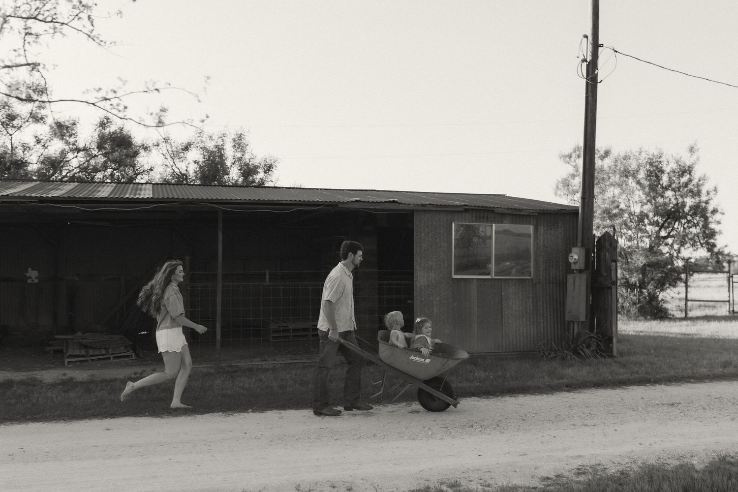
Gone are the days of identical white shirts and blue jeans. Instead of matching every outfit exactly, choose a color palette and build around it. Soft neutrals, warm earth tones, muted blues, and textured fabrics create depth while allowing each family member's personality to stand out naturally.
Photographer's Tip
Texture Makes Every Photograph Feel More Luxurious
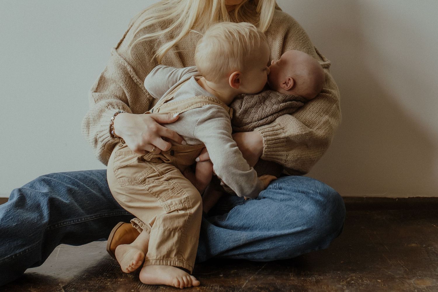
Linen, cotton, gauze, knits, eyelet lace, and soft denim photograph beautifully because they catch light naturally and create movement. These subtle details bring warmth and dimension to your images, making your gallery feel effortless rather than overly posed.
The Best Colors for Family Photos
My favorite color palette includes:
• Cream
• Ivory
• Oatmeal
• Camel
• Taupe
• Chocolate Brown
• Sage Green
• Olive
• Soft Denim
• Black
These colors photograph beautifully in every season and complement natural outdoor locations without overpowering your family's connection.
Why Color Matters More Than You Think
When planning outfits for your family session, most people focus on whether the colors look good together. But what many don't realize is that the colors you wear actually reflect onto your skin.
Bright reds can cast warm red tones across your face, vibrant greens can create an unnatural tint, and bold blues or hot pinks can affect the way light interacts with your skin. While these color casts can often be corrected during editing, they can make photographs feel less natural and take away from the soft, timeless look so many families love.
Instead, I always recommend building your wardrobe around soft neutrals and earthy tones like cream, oatmeal, camel, taupe, sage, muted blues, and chocolate brown. These colors photograph beautifully, complement natural light, and keep the focus exactly where it belongs on your family's connection.
The goal isn't to make everyone wear beige. It's to choose colors that enhance your photographs instead of competing with them.
Photographer's Tip
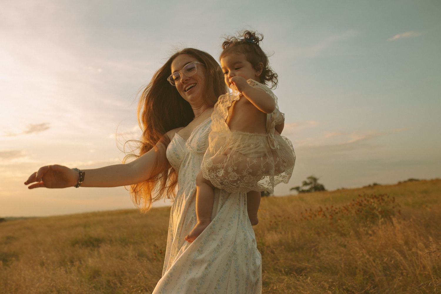
Light doesn't just illuminate your family... it also reflects the colors around you. Choosing timeless, neutral tones allows beautiful golden light to flatter your skin naturally, creating warm, clean, and cohesive images that will never feel dated.
WANT THE COMPLETE STYLING GUIDE?
Choosing outfits doesn't have to be overwhelming.
Inside my Family Outfit Guide, you'll find my exact color palettes, favorite fabrics, styling tips for every family member, accessories that elevate your session, and a complete photo day checklist to help you feel confident before you ever step in front of the camera.
Download the complete guide for just $7 and take the guesswork out of planning your family photos.
FAQ
Do bright colors affect photos?
Yes. Bright, saturated colors can reflect onto skin and create unwanted color casts, especially in natural light. Reds may create warm tones, greens can introduce a green tint, and neon colors often pull attention away from your family's expressions. Neutral, earthy colors tend to photograph more naturally and create a timeless, cohesive look.
FAQ
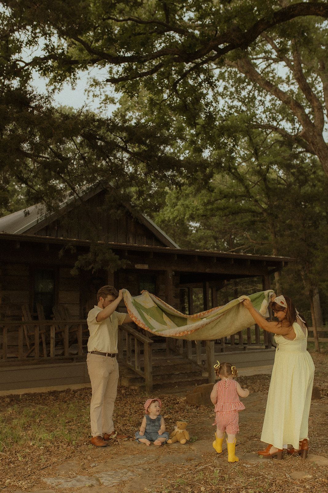
Can You Wear Bold Colors for Family Photos?
Absolutely! While I often recommend soft, neutral tones for a timeless look, bold colors can be incredibly beautiful when they're chosen with intention.
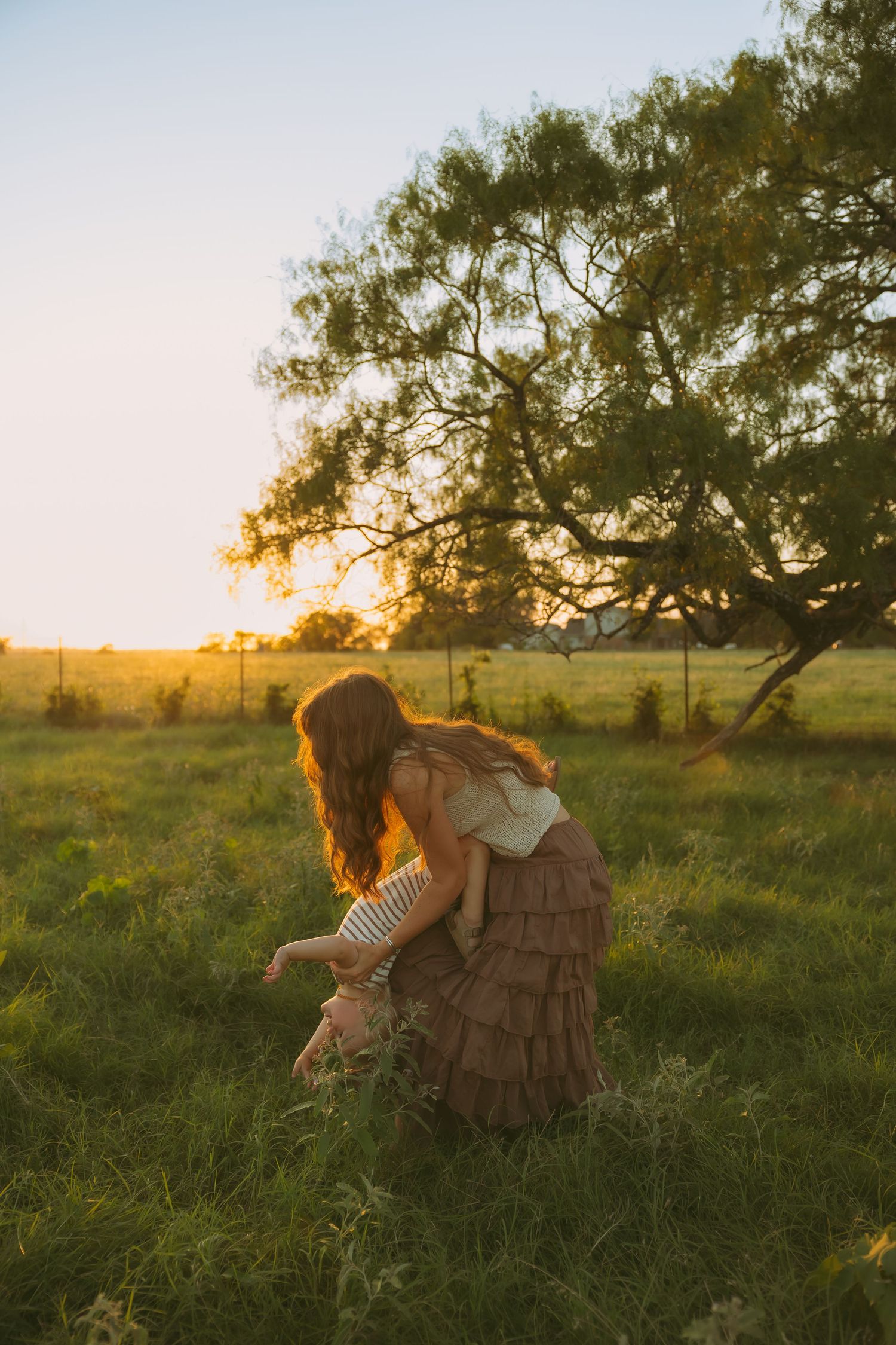
The session pictured here is a perfect example. The rich reds and warm yellows complemented the season, the location, and the overall story they wanted to tell. Instead of overwhelming the images, the colors added warmth, personality, and a playful energy that felt authentic to their family.
The key is balance. When bold colors are thoughtfully coordinated with the environment and the rest of your family's wardrobe, they can create photographs that are just as beautiful and meaningful as a neutral palette.
Every family and every session is unique. That's why I always encourage my clients to share their vision with me. Together, we can choose outfits that reflect your personality while photographing beautifully.
1 more tip
There aren't "right" or "wrong" colors... only colors that best support the story you're trying to tell. Whether your vision is soft and cinematic or vibrant and full of personality, thoughtful styling always makes the difference.